I first came across this approach of looking at data when I was undertaking a Master’s degree with the world’s first Professor of Quality Management, a great guy called John Oakland. Now, this thinking and these tools and techniques are so powerful (and so criminally (IMHO) under-utilised) that if I didn’t have a mortgage to pay, I’d coach interested and open-minded leaders and managers in them… for free!
In the last blog we looked at a variety of Core Activity Maps; today we are going to dive into a couple of measures taken from one of those Core Activity Maps, a real-life company:
- A manufacturer and distributor of electronic products which control the environment (temperature, humidity etc) of offices and workplaces;
- With a turnover of £6m which they are looking to grow to £10m over the next 3 years;
- Who export 60% of the products abroad;
- With around 40 staff – the majority in the UK.
In the previous blog we looked at how, with this company, we developed the following Core Activity Map, showing how they deliver value to their clients. With this in mind, we are now going to link to a couple of process measures:
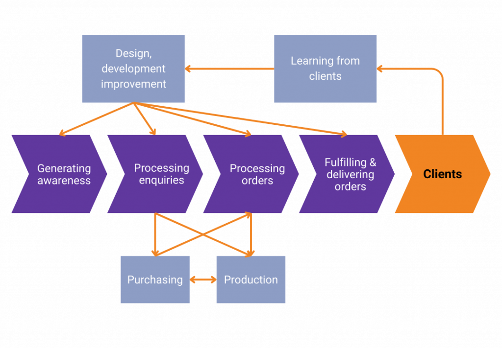
But where should we start? Well, we start from the outside and work in – as such, the question we ask is “what is it that the customers see?”
In this instance, there are two parts of the process where the customers can peer into company processes, so where we need to measure “hard” facts, figures and results:
- The quote response time at the front of the process and;
- The on-time delivery time at the end of the process.
We are going to look briefly at the on time delivery data which is shown below.
You’ll notice that by taking this longer term “movie view” of data, as opposed to the more usual “snapshot” view, we can see the performance over a 7-8-month period and in the middle the performance improves for a brief period then reverts. This is a significant process shift which, because data was presented in tables, was completely missed. However, I want to explore a similar shift but for a metric usually much closer to a leader’s heart.

Margins
In the first chart below, you can see the plot for the overall monthly margin for the last two years or so. The average is around 52%, but the data actually wibbles and wobbles a bit around this average. The high point being nearly 58% in the first December. The question is whilst this number is the highest seen for some time, is it actually special in any way?
Unless the range of chance distribution is calculated and placed on the chart, you CANNOT know!
Unfortunately, even if we plot charts, it’s rarely done incorporating the range of chance distribution. Which means we make poor decisions as:
- We think results are “special” when they are not, but we take action anyway;
- We don’t notice when they are actually “special” and we should be taking some action.

(See the points in red below).

We can get into the detail of how the green lines of chance distribution are calculated, but I think that’s for a different day – let me know if you are interested.
Developing these ideas as a decision making tool, we can then utilise another feature of these charts to recalculate both the limits and the average for this period, as it looks like there is something fishy going on. This is confirmed in the graph below. For that eight-month period the margin did indeed drop.

However, after August it reverted to its original pattern. Upon investigating it appears that for the 8-month period the margin deteriorated as a direct result of currency fluctuations. This was completely missed by the then method of looking at data on a monthly basis.
Additionally, you’ve also probably noticed that both December figures are high. This was because on a monthly basis the FD assumed that ALL of the distributors hit ALL of their targets and that maximum commissions would be paid. As this rarely occurred, at the end of their financial year (December) these accruals were added back into the accounts which had the effect of increasing the margin for that month!
Lastly, as can be seen from the final chart we can also add in dotted lines showing the predicted future limits. Yes, we can predict the future. If nothing changes, we would expect all future results to fall between the limits.

However, if, as leaders and managers, the limits are not to our liking (as is very often the case) then it our job to improve the process.
Improving the process means making changes to the process which move the upper and lower levels closer together (the process becomes more predictable), and also to move the average up, if up is good (sometimes up is bad). Think debtor days or accidents!
Conclusion
We have only taken a couple of measures, on time delivery and margins, but this thinking can be applied to any measure you want to review over time; minutes, hours, days, weeks and months; for instance:
- Profit
- Sales
- Cash in the bank
- Debtor / creditor days
- Output
- The list is long…
And using this approach to look at performance your performance measures allow you to:
- Predict the future performance of your processes;
- Identify “signals” from “noise” in your performance measurement data;
- Prove when “changes” you make to processes are in fact (statistically and scientifically verifiable) “improvements”.
These ideas to can be employed to transform our thinking and the way in which we manage our organisational processes and deliver real, sustainable and properly quantifiable improvement.
Related tools and ideas
- Purpose
Recommended references
- Dragon Slaying: A better way to manage – Mark Woods
- Email mwoods@statius.co.uk to receive your free copy.